Adding Data Visualizations
The last 2 writeups were about r/NBA Mentions and IAAF Scores, what they do and how they work. They're both fairly simple and I wanted to add some data visualizations to them, so I decided to add bar chart races to r/NBA Mentions and progression charts to IAAF Scores.
Adding Bar Chart Races to r/NBA
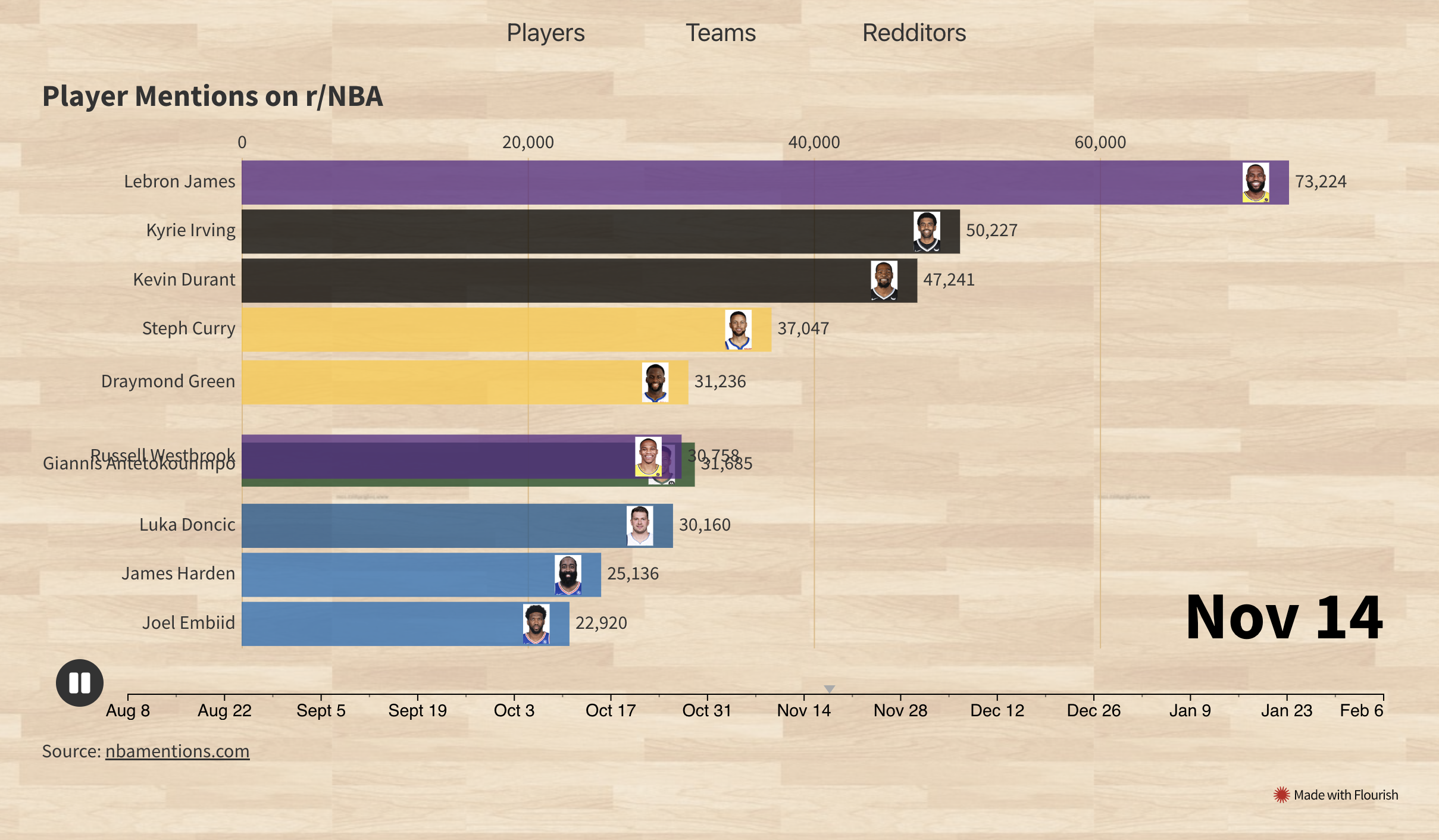
I'd been collecting r/NBA comments for over 6 months and had a few million comments in a Postgres DB at this point. Enough time had passed for there to have been fluctuations and changes in who was being discussed most. I wanted to visualize these changes over the 6 months in a type of chart I'd seen online before that compared the world's largest populations over time. After some searching online, I found that these were called race charts. I had a few failed attempts at making these race charts programmatically in Python and JavaScript, with Google Sheets, and with Zoho. Luckily I stumbled across Flourish, a site that provides data visualization tools. To aggregate the data from the Postgres DB, I ran SQL queries counting the number of times a player was mentioned each week from August to February. I did this for the top 15 players, teams and redditors. Then it was just a matter of loading the data into a Flourish spreadsheet and tweaking the UI controls. The final charts for the players, teams and redditors can be found on r/NBA Mentions. One thing I'd like to improve in the future would be to have the charts always using the most up-to-date data, as right now it's just using the same from August to February 6th.
Adding Progression Charts to IAAF Scores
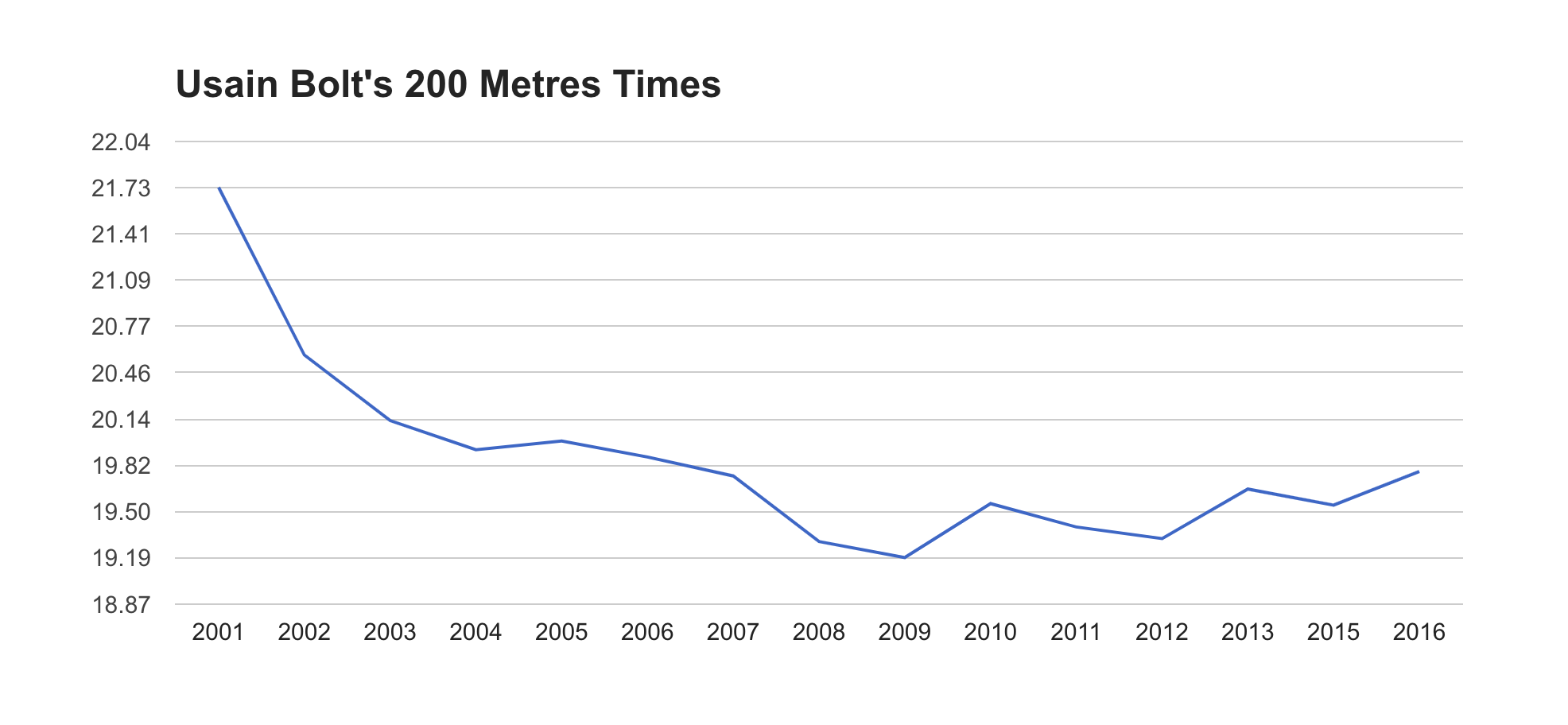
For IAAF Scores, I wanted a way to see the progression of different athletes' performances in different events. I wasn't able to find anything that did this online, but I knew the data to make it was available on the World Athletics site. What I wanted exactly was a way to search for an athlete in a specific event, and see their best performance each year in a line graph. This would provide insights about a number of things:
- When a certain athlete peaked
- How long do athletes peak for
- When and how fast do they start to decline
- When and how fast do they start to improve
The latter two points are especially interesting because they could, in theory, provide some insight into doping accusations.
Collecting and displaying this data ended up being more difficult than I expected. I knew I would at least need a UI to input an athlete's name, an event and a season (outdoor or indoor). Okay, easy so far.

It seemed the next step would be to take those inputs and go fetch the data. I knew this would be potentially challenging so instead I chose to focus on how I would display the data first. This would also let me know what format I needed to return the data in. I tried and failed several different times to integrate a chart library into the Svelte app. The one that seemed most promising though was the Google Charts library, so I decided to focus on integrating this one. After another couple of failed attempts at importing this library with different npm packages, I FINALLY got it working 🎉. I'm going to skip ahead here for a second to after I got the data fetching working.
Initially, I had only been testing with athletes in the 100m and 200m events, whose times are all of the form ss.xx (e.g. 19.32). The Google Charts library requires all y-axis values to be floats, which was no problem since 100m and 200m times can be represented as floats. When I started testing athletes in events above 400m, I realized their times are all of the form mm:ss.xx, which is not a float. Okay, it's easy to convert that time into a float by calculating the number of seconds. This works, except that the y-axis of the chart is now measured in seconds instead of formatted as mm:ss.xx. This sent me down another rabbit hole of how to pass the times as floats to the Google Charts library, but have them formatted on the y-axis in mm:ss.xx format. Again, after a few failed attempts on Stack Overflow and reading through documentation, I did end up finding a Stack Overflow post that explained you need to iterate over the data range and manually create the y-axis tick lines, where you can also choose how they are formatted! A little cumbersome, but this is exactly what I needed, and with that I had the charts displaying properly.
Fetching The Progression Data
The World Athletics site provides season's best progression data on their website in tables like this:
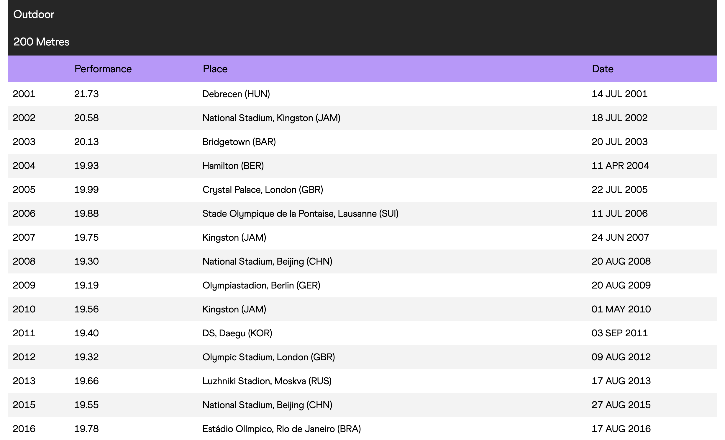
So I just needed to get the data from this page and format it for the Google Charts library. First, I looked if there was an API I could use to get this data.
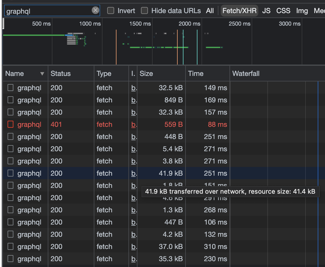
I could see the page was making a few calls to a GraphQL API, and one of them was fairly large, so I thought it might have the progression data. Upon further inspection, it had similar data but it was for winning streaks. This gave me hope so I proceeded to check every other graphQL API call the page made, only to find that none of them contained the season's best progression data on the page 😢.
At this point, I was pretty confused about how the page was getting the data. Then I realized that I was only looking at Fetch/XHR network requests, and that the data may be coming back in the HTML response.

This seemed promising! I took a look at the HTML it returned, and after digging around it for a while I finally found the data. Buried in this script tag
<script id="__NEXT_DATA__" type="application/json"></script>
was a JSON object that contained an object named "progressionOfSeasonsBests". This object contained lists of event progressions for an athlete. So given an athlete and an event, if I could get this JSON object I could parse out the event progression for that athlete.
This posed another problem though, which was that the URL for an athlete's page includes their country and a random ID.

So now I needed a way to get an athlete's country and ID given their name. After some more digging around the World Athletics site, I found this page:
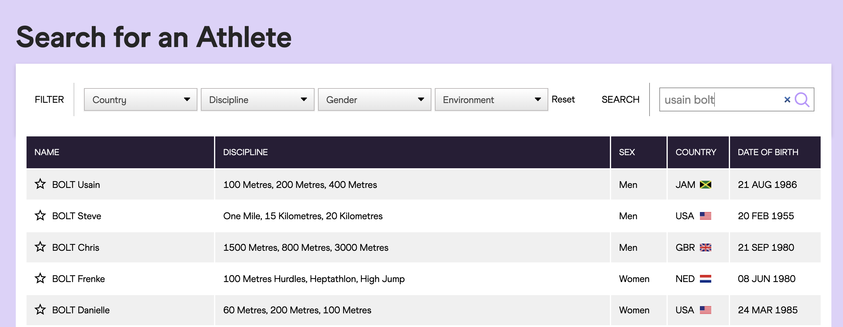
Which returns a list of athletes given a name. I saw that this search was being done by a graphQL API call that passed in a search string, and got back a list of athlete's info whose names matched the search string. Part of this athlete info was a field
"urlSlug":"jamaica/usain-bolt-014201847"
Which is exactly what I needed to get the season's best progression data! Cool, so now I had a way to get the progression data given a name and event, I just needed to put it all together. It would work like this:
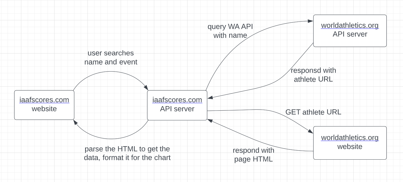
At last, I now had an end-to-end way to generate progression charts for any athlete in any event. For the backend, I knew I would need to:
- Make HTTP requests programmatically
- Scrape HTML pages
- Parse through lots of data
Given these requirements, Python seemed like a good fit for the job. For the API server, I decided to try out FastAPI for the first time. It was easy to set up and use, but my use case was very simple so I didn't get to explore it too much. For the HTTP requests, I used the Python requests package, and for the HTML scraping I used Beautiful Soup. Now to deploy this backend API server, I would normally use Heroku. However they unfortunately removed their free tier options, and I didn't want to pay $7/mo for this. While searching for how to deploy FastAPI apps, I came across a small cloud hosting provider called Deta and decided to give it a try. It was free, quick to set up, and easy to use, so I'm definitely planning on using it again in the future. My only concern is that it seems very lightweight, so I'm not sure how it would handle more complicated projects.
Final Words
So that was how I went about adding data visualizations to my r/NBA Mentions and IAAF scores projects. Both sites had interesting, challenging, and annoying problems to overcome, but I enjoyed the process and learned along the way. I'll probably stop development on these projects for the time being, although I'd like to add an option to compare multiple athletes' progressions at once on the chart.
If you'd like to use either site, they are here and here. If you're interested in seeing more technical details, you can read the source code on Github here and here. Thanks for reading!